Revere Pewter (HC-172) is the paint color people still talk about years after they first painted their walls with it. It is not trendy, yet it never feels dated. It is not gray and not beige it sits perfectly in the middle and somehow makes every room look polished and inviting. Thousands of homeowners, designers, and even real-estate agents call it the “perfect greige,” and once you see it in person, you understand why. This long guide covers absolutely everything: the undertones, the LRV, the best trim colors, the rooms where it shines, the ones where it doesn’t, similar colors, real-home photos, sampling tips, and honest pros and cons in 2025. By the end you will know exactly whether Revere Pewter belongs on your walls.
What Exactly Is Revere Pewter?
Revere Pewter is a warm gray-beige (greige) paint color from Benjamin Moore’s Historical Collection. The code is HC-172. It was introduced many years ago but exploded in popularity around 2015–2016 when greige took over from pure beige. The color reads as a soft, warm gray in most lights, yet it keeps a subtle beige warmth that stops it from ever looking cold. People love it because it acts like a neutral but still has personality. One day it looks more gray, the next day more taupe lighting and surroundings change it in the prettiest way.
The Undertones You Need to Know About
The secret behind Revere Pewter’s magic is its green undertone. Yes, green. When you put it next to a pure gray, you notice a faint olive or sage hint. That green keeps the color from turning purple (like some grays do) or too yellow (like many beiges do). In north-facing rooms the green becomes more obvious and the color looks cooler. In south-facing rooms the warmth comes forward and it feels like a cozy taupe. East-facing morning light makes it look crisp; west-facing afternoon light turns it golden. Understanding this green undertone is the difference between loving the color and wondering why it looks “off.”
Light Reflectance Value (LRV) Why It Matters
Revere Pewter has an LRV of 55.51. That number means it reflects a medium amount of light brighter than dark moody colors but darker than pale ones. Rooms with big windows feel airy and open. Smaller rooms or spaces with few windows feel cozy instead of cave-like. Because the LRV sits right in the middle, Revere Pewter works in almost every lighting situation except extremely dark basement rooms (there it can feel a little flat). Most people find the LRV perfect for whole-house color because it is light enough to brighten but dark enough to hide everyday scuffs.
Why Revere Pewter Is Still So Popular in 2025
Trends come and go, yet Revere Pewter stays near the top of Benjamin Moore’s best-seller list every single year. Real-estate agents love it for staging because it appeals to almost every buyer. Designers love it because it plays nicely with every style modern farmhouse, traditional, mid-century, coastal, even boho. Homeowners love it because once it’s on the walls, furniture and art just look better. The color flatters wood tones, makes white trim pop, and hides imperfections better than lighter paints. In short, it is the “little black dress” of paint colors.
Best Rooms for Revere Pewter
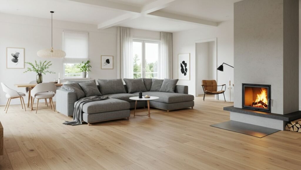
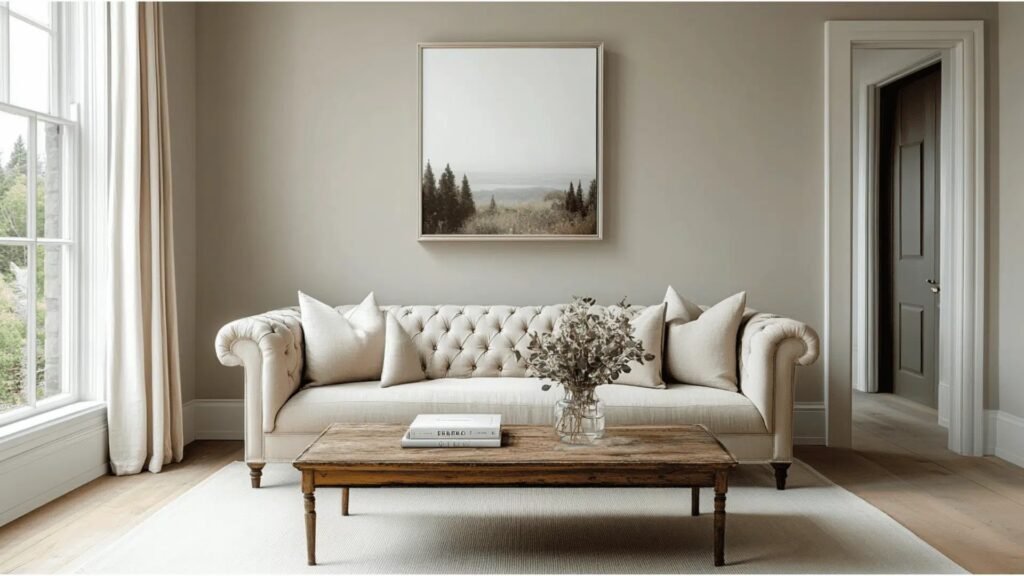
Living Rooms and Family Rooms Revere Pewter creates the perfect backdrop everyone wants for family photos warm but not yellow, sophisticated but not stuffy. Leather sofas, linen sectionals, and velvet chairs all look expensive against it. Add wood coffee tables and jute rugs and the room feels collected and timeless.
Kitchens and Dining Rooms Many people paint kitchen cabinets or islands, or full walls Revere Pewter. Paired with white quartz counters and brass hardware it looks fresh and current. In dining rooms it makes evening dinner parties feel elegant without trying too hard.
Bedrooms (Primary and Guest) The slight green undertone is surprisingly calming. People sleep well in Revere Pewter bedrooms. Layer white bedding, wood nightstands, and textured throws for a peaceful retreat feel.
Home Offices and Studies The color is dark enough to feel focused yet light enough not to close the room in. Zoom calls look professional your face shows up well against the neutral background.
Entryways and Hallways and Staircases These high-traffic spots need a color that hides shoe marks and fingerprints. Revere Pewter does exactly that while making the first impression warm and welcoming.
Bathrooms Powder rooms painted feel luxurious. Full bathrooms with white tile and marble look spa-like instead of builder-basic.
Rooms Where Revere Pewter Might Not Work
Very dark basement rooms with small windows can make the color fall flat and slightly gloomy. Super-modern minimalist spaces that want bright cool white walls sometimes find Revere Pewter too warm. Tiny bathrooms with no natural light can read a bit dingy. In those cases a lighter greige usually works better.
Best Trim and Ceiling Colors for Revere Pewter
White Dove (OC-17) soft warm white, very popular pairing Chantilly Lace (OC-65) crisp bright white for higher contrast Simply White (OC-117) clean and fresh, slightly warmer than White Dove Cloud Cover (OC-25) for tone-on-tone look Decorator’s White (OC-149) cool bright white for modern feel
Most people choose White Dove or Chantilly Lace. Ceilings are usually the same trim color or one shade lighter (like Benjamin Moore Ceiling White).
Accent Colors That Look Amazing with Revere Pewter
Navy Blue (Hale Navy, Gentleman’s Gray) Teal and Sage (Saybrook Sage, Aegean Teal) Blush Pink (First Light, Head Over Heels) Terracotta and Rust (Moroccan Spice, Potters Clay) Black (Onyx, Black Beauty for doors) Brass and Gold accents Natural wood tones (oak, walnut, cherry)
Furniture and Decor That Pairs Perfectly
Warm wood furniture (the green undertone loves oak and walnut) Cream or white sofas Leather in cognac or chocolate or black Jute sisal or patterned wool rugs Linen drapes in white oatmeal or charcoal Plants lots of green plants look incredible against it Brass or black picture frames and lighting
Revere Pewter vs. Other Popular Greiges (2025 Comparison)
Revere Pewter vs. Agreeable Gray (Sherwin Williams) Agreeable Gray is lighter (LRV 60) and more true gray. Revere Pewter feels warmer and deeper.
Revere Pewter vs. Edgecomb Gray (Benjamin Moore) Edgecomb Gray is lighter (LRV 63) and more beige. Revere Pewter stays grayer.
Revere Pewter vs. Accessible Beige (Sherwin Williams) Accessible Beige pulls much more beige/tan stays balanced.
Revere Pewter vs. Balboa Mist (Benjamin Moore) Balboa Mist is lighter and cooler Revere Pewter has more depth and warmth.
Revere Pewter vs. Repose Gray (Sherwin Williams) Repose Gray is cooler and slightly darker with possible purple undertones.
Revere Pewter vs. Classic Gray (Benjamin Moore) Classic Gray is much lighter and pinker Revere Pewter looks greige by comparison.
Real Homes Using Revere Pewter (What It Actually Looks Like)
Open-concept homes with white kitchens and dark wood floors the color flows beautifully from room to room. Farmhouse-style homes with shiplap and black windows Revere Pewter softens the black and makes everything feel cozy. Modern homes with clean lines and minimal decor the warmth keeps it from feeling sterile. Traditional homes with dark wood furniture and oriental rugs the color updates the look without clashing. Coastal homes with white furniture and blue accents the green undertone ties in perfectly with ocean colors.
How to Properly Sample Revere Pewter Before Committing
Buy a sample pot and paint at least 2 coats on poster board (not directly on the wall yet). Move the board to different walls and rooms north south east west facing. Look at it in morning light afternoon light evening light and with lamps on. Live with it for at least a week. Colors change dramatically throughout the day. Compare it next to your flooring cabinets and furniture fabrics.
Samplize peel-and-stick samples are also excellent because you can move large sheets around easily.
Pros of Choosing Revere Pewter
Hides dirt and fingerprints better than light colors Works with almost every style and wood tone Makes rooms feel larger and brighter than darker colors Timeless won’t look dated in five years Flatters skin tones in photos and Zoom calls Forgiving color small wall imperfections disappear Flows beautifully in open floor plans Increases resale value (agents love it)
Cons and Things to Watch Out For
Can look a bit dark in windowless rooms Green undertone surprises some people in north-facing light Not the best choice if you want a super-light airy feel Shows brush/roller marks more than some other colors (use good technique) Very popular so your house might look like many others (but most people see that as a pro)
Current Alternatives in 2025 That Give Similar Vibes
Benjamin Moore Pale Oak (lighter warmer sister) Benjamin Moore Balboa Mist (cooler lighter version) Benjamin Moore Edgecomb Gray (more beige) Sherwin Williams Agreeable Gray (closest dupe) Sherwin Williams Accessible Beige (warmer beige side) Behr Mocha Foam (budget-friendly similar tone) Valspar Chicago Blues (unexpected but very close)
Professional Painting Tips for Best Results with Revere Pewter
Use Benjamin Moore Regal Select or Aura in matte or eggshell finish. Prime first if going from dark to this color. Two coats minimum three if covering red or navy. Cut in carefully; the color contrast with white trim shows mistakes. Paint on a cloudy day if possible direct sun makes wet paint look lighter than it dries. Keep a wet edge to avoid lap marks.
How Lighting Changes Revere Pewter Completely
North-facing rooms: cooler greener more true gray South-facing rooms: warmest golden almost taupe East-facing rooms crisp and bright in the morning West-facing rooms: golden and cozy in the afternoon/evening LED bulbs 2700K 3000K brings out warmth Cool white LEDs 4000K+ makes it look grayer
Frequently Asked Questions About Revere Pewter
Is Revere Pewter still popular in 2025? Yes still in Benjamin Moore’s top 5 best-sellers.
Does it look purple ever? Almost never the green undertone prevents purple flashes.
Is it warm or cool? Warm-leaning neutral with a green base.
What sheen should I use? Matte or eggshell walls satin or semi-gloss trim.
Will it make my small room feel smaller? Usually not the medium LRV keeps things balanced.
Conclusion Is Revere Pewter Right for Your Next Project?
After painting hundreds of rooms and helping countless friends choose colors, I can say with confidence that Revere Pewter earns every bit of praise it gets. It is forgiving, beautiful, and truly timeless. If you want a neutral that feels warm without being beige, looks sophisticated without being cold, and works with whatever furniture you own now or might buy laterthis is the color. Paint a big sample, watch it for a week in your actual light, and I bet you’ll be as obsessed as the rest of us.